Contents
1 Create your first graph: We will draw a parabola f(x) = (x-5)**2 | |
| step 1.1 | Start the program. |
| step 1.2 | From the File menu (it is the only available right now), choose new. |
| step 1.3 | In the "Select File Type" dialogue window, choose "spreadsheet" and push "OK". A blank spreadsheet "document1" is created. |
| step 1.4 | Click in the spreadsheet cell at column 1, row 1. |
| Then type (without the quote marks): "mV" followed by <RETURN>, then type "0" <RETURN>, "1" <RETURN> etc. until "10" <RETURN>. If you type a wrong character, use the <BACKSPACE> key. | |
| step 1.5 | Click in the spreadsheet cell at column 2, row 1. |
| Then type (without the quote marks): "mA" followed by <RETURN>, then type "25" , "16" , "9" , "4" , "1" , "0" , "1" , "4" , "9" , "16" , "25", where each number is followed by a <RETURN> | |
The spreadsheet should now look like: | |
| step 1.6 | Click on "column" key number 1 and, while keeping the left mouse button depressed, move onto column key 2 and release the mouse button. Now the two columns 1 & 2 are selected: |
| step 1.7 | From the Modify/Stats menu select Line Plot. |
| step 1.8 | In the "Set Columns" dialogue window check "X". This means that column 1 will furnish the X-coordinate. |
| step 1.9 | Advance one column by pushing the |
| step 1.10 | Push the "OK" button. A new drawing window "document2" is created containing the graph: |
| step 1.11 | From the File menu choose save (document2 needs to be the active window. If you have clicked on document1, reactivate document2 by clicking on its title bar before going to the File menu). In the "Save" dialogue window type "step1" as filename. The title bar now reads "step1.his" (the extension is added automatically). |
| Note that the column keys 1 & 2 in the spreadsheet now contain a "°" character. This means that these columns are linked with a graph on a drawing sheet. The use of these links is the subject of the next exercise. | |
2 Edit the graph using the spreadsheet | |
| If you just carried out step 1, leave the program and restart it. (It is not necessary to save document1). | |
| step 2.1 | From the File menu choose open and load "step1.his" that was created in step 1. A drawing window is created containing the parabola. |
| step 2.2 | Click on one of the elements of the graph. Eight little boxes appear around the graph. It is now selected: |
| step 2.3 | Push the "copy" icon |
| step 2.4 | From the File menu choose new. |
| step 2.5 | In the "Select File Type" dialogue window, choose "spreadsheet" and push "OK". A blank spreadsheet "document1" is created. |
| step 2.6 | Click in the spreadsheet cell at column 1, row 1. |
| step 2.7 | Push the "paste" icon |
| step 2.8 | Move the spreadsheet such that both graph and columns are visible. |
| step 2.9 | Click in the cell at column 2 and row 7. It contains "0". Then type "10" followed by <RETURN>. The contents of the cell are replaced by "10" and the curve in the graph is updated: |
| step 2.10 | Select undo from the Edit menu. The original curve is restored. Cell [2,7] reads "0" again. |
| step 2.11 | Click on the row key number 2, thereby selecting row 2: |
| step 2.12 | Push the "delete" icon |
| step 2.13 | Close all windows without saving. |
3 Changing the layout of the graph. | |
| step 3.1 | Open file step1.his (as in step 2). |
| step 3.2 | Double-click on one of the axes (and hence not on the curve). The "Axes" dialogue window appears. |
| step 3.3 | Under "Y-axis" on the right, replace "To" "30" by "To" "25". |
Set "Major tick every" "5". | |
| step 3.4 | Double-click on the curve. The "Curve properties" dialogue window appears. |
| step 3.5 | Uncheck the "connect points with line" checkbox. Push the "OK" button. The graph should now look like: |
| step 3.6 | Select save as from the File menu and give "step3" as new file name (the extension .his will be added automatically). |
4 Fitting a function to a curve. | |
| step 4.1 | Open file step3.his, created in step 3. |
| step 4.2 | Double-click on one of the data points (open circles). The "Curve properties" dialogue window appears. Move it such that the graph on the drawing sheet becomes visible. |
| step 4.3 | Push the "Function" button. The "Fit" dialogue window appears on top of the previous one. If necessary move it to uncover the graph. |
| step 4.4 | From the list of functions select '*parabola" and push the "<<" button. The text in the edit box now reads: "a+b*(X-x0)^2", the definition of a parabola. Push the "OK" button. |
| step 4.5 | In the "Curve properties" dialogue window that now reappears, push the "Do Fit" button. |
| step 4.6 | The "Fit" dialogue box reappears and the fitted curve is plotted onto the graph (in red). The estimated parameters are: a=0 (or very close to it), b=1 and x0=5. Push the "OK" button. |
| step 4.7 | Push the "OK" button in the "Curve properties" dialogue window. The graph should now look like: |
| While the curve in step 1.10 had its data points interconnected by line segments, this graph has its data points interconnected by a smooth function. | |
| step 4.8 | Save the drawing sheet as "step4.his". |
5a Students t-test | |
| step 5.1 | Create a new spreadsheet and enter data as in step 1: |
| step 5.2 | Select columns 1 & 2 (as in step 1.6). |
| step 5.3 | From the "Modify/Stats" menu choose "Get column stats". The following dialogue window pops up: It shows means, standard deviations and standard errors of the means for the two columns. Supposing that the data are paired (e.g. each pair of data in a row has been obtained before and after some manipulation), then the probability (P) that the two samples of data in columns 1 and 2 belong to the same parent population is 2.3%. |
| step 5.4 | Push the "OK" button. The dialogue window disappears. |
| step 5.5 | Click on the spreadsheet cell at column 4, row 1 and push the paste icon in the program icon bar. The statistical data are now available on the spreadsheet for future manipulation: |
5b Fishers F-test | |
| step 5.6 | Start a fresh spreadsheet and enter the following data in three columns: |
| step 5.7 | Select columns 1,2 & 3 (as in step 1.6). |
| step 5.8 |  From the "Modify/Stats" menu choose "Get column stats". The following dialogue window pops up: From the "Modify/Stats" menu choose "Get column stats". The following dialogue window pops up:Because the t-test is not valid if one disposes of more than 2 sets of data, Fishers F-test (or one-way ANOVA) is carried out. The small P indicates that the three columns of data do not come from the same population. In order to know which is (are) the data set(s) that deviate, Tukey's multiple comparison test (q-test) is carried out next. As the number of data sets may be large (256 columns is the maximum), the result is not shown in the dialogue box. Push the "OK" button and paste the clipboard onto the spreadsheet:
|

6 Creating a graph using functions: we'll make a sine wave | |
| step 6.1 | Create a new spreadsheet (see step 1) |
| step 6.2 | In column 1, row 1 enter "s". In column 2, row 1 enter "V" (see step 1) |
| step 6.3 | Click in cell column 1, row 2 and then click in the spreadsheet edit box: |
| step 6.4 | Type (without the quote marks) "=(lin-2)*0.01" followed by <RETURN> |
| step 6.5 | Click in cell column 2, row 2 and then click in the spreadsheet edit box |
| step 6.6 | Type (without the quote marks) "=sin(2*pi*2*" (N.B. no <return> !). |
| step 6.7 | RIGHT mouse click in cell column 1, row 2. The following should show: |
| step 6.8 | Type ")", followed by <RETURN>. The result is:
We've now entered two formulas and the (not too exciting) result is shown. |
| step 6.9 | 
Click in the cell at column 1, row 2, and while keeping the left mouse button depressed move the mouse pointer downwards, moving it over the bottom window border. The window will scroll. Release the mouse button when you point in the spreadsheet cell at column 2, row 102. |
| Now all cells in the range from column 1, line 2 to column 2, line 102 are selected. | |
| step 6.10 |
 From the Fill menu choose down copy. Now all formula will be copied downwards |
| step 6.11 | Push the "home" key: |
| In order to plot the two columns, we could proceed as in step 1.6 through 1.11. Here we'll follow an alternative method. | |
| step 6.12 | Click the column key number 1:
|
| step 6.13 | From the Modify/Stats menu select Set as X-column. |
| step 6.14 | Click the column key number 2 and from the Modify/Stats menu select Set as Y-column. |
 The X and Y columns are now indicated on the column keys. The X and Y columns are now indicated on the column keys. | |
| step 6.15 | From the Modify/Stats menu select Line plot. A new drawing sheet is created with the following graph: |
| We will combine this graph with the result of step 4. | |
| step 6.16 | Click on one of the elements of the graph. Eight little boxes will indicate that the graph is selected. |
| step 6.17 | Push the copy icon in the program icon bar. |
| step 6.18 | Open the file "step4.his". |
| step 6.19 | Enlarge the window to show an empty place where you'd like to paste the sine wave and click once on this spot. That is where the centre of the sine wave graph will be. |
| step 6.20 | Push the paste icon in the program icon bar: |
| step 6.21 | Finally push the "save" icon |
7 A few last details: We'll make figure "step4" ready for publication. | |
| step 7.1 | If it is not open yet, open file "step4.his". Size the window such that we have room to work. |
| step 7.2 | Select the parabola graph by clicking once on it. Depress the <SHIFT> key and while keeping it depressed click once on the sine wave graph. Release the shift key. Now both graphs are selected. |
| step 7.3 | Click on either graph, and while maintaining the left mouse button depressed, move it to the right and slightly to the bottom. The two graphs move. Release the mouse button when there is a reasonable left margin. |
| step 7.4 | Unselect the graphs by clicking anywhere on the sheet. |
| step 7.5 | From the "drawing tool box" click the text tool: |
| step 7.6 | Click left of the parabola and type "A". Click left of the sine wave and type "B". Click underneath the parabola and type "a parabola". Click underneath the sine and type "a sine". Then select the "arrow" tool from the drawing tool box (just left of the text tool). |
| step 7.7 | Select both the "A" and the "B" text objects by clicking on them and using the shift key as in step 7.2. |
| step 7.8 | Click on the "font tool  |
| step 7.9 | Click the "align tool"  |
| step 7.10 | Select the two graphs, click the align tool and push the "OK" button in the dialogue window. |
| step 7.11 | Similarly bottom-align the two text objects "a parabola" and "a sine". |
| step 7.12 | Select the "a parabola" text object and move the object to the left or the right using the horizontal arrow keys on your keyboard. Do the same with the "a sine" object. |
| step 7.13 | Save the file. The result may resemble: |

8 Deleting objects and dissociating a graph. | |
| step 8.1 | Load file "step4.his" that was modified and saved in step 7. |
| step 8.2 | Click above and left of the "A" on the drawing sheet. While keeping the left mouse button depressed move mouse downward and to the right until you reached a point just below and to the right of the text "a sine": |
| step 8.3 | Release the mouse button and push the "delete" icon |
| step 8.4 | Click on the sinewave graph and choose Dissociate from the Edit menu. The graph is now dissociated into several elements. Click anywhere on the drawing sheet to unselect the objects, select the sine wave and then drag it to the left: |
| step 8.5 | Double-click on the sine wave. Then RIGHT mouse click until the scissors cursor appears. |
| step 8.6 | Move the cursor as in the figure and left-mouse click to cut the sine wave in two. |
| step 8.7 | Unselect by clicking anywhere. Select the left sine period and drag it to the left: |

9 Creating a bar plot with error bars. | |
| step 9.1 | Start the program. |
| step 9.2 | From the File menu (it is the only one available right now), choose new. |
| step 9.3 | In the "Select File Type" dialogue window, choose "spreadsheet" and push "OK". A blank spreadsheet "document1" is created |
| step 9.4 | Click in the spreadsheet cell at column 1, row 1. |
| Then type (without the quote marks): "50" followed by <RETURN>, then type "72" <RETURN>,and "66" <RETURN>. If you type a wrong character, use the <BACKSPACE> key | |
| step 9.5 | Click in the spreadsheet cell at column 2, row 1. |
| step 9.6 | Click in the spreadsheet cell at column 3, row 1. |
| step 9.7 | Click in the spreadsheet cell at column 4, row 1. |
| step 9.8 | Select the columns 1 through 4 (see step 1) and from the Modify/Stats menu select Bar Plot. The "Set Columns" dialogue window pops up: |
| step 9.9 | n the "Set Columns" dialogue window check "Y" (the default). This means that column 1 will be the Y-coordinate. |
| step 9.10 | Advance one column by pushing the Advance again, check "Y", advance again one column (we are now at column 4) and check "SEM". Push "OK". The following graph will be created:  |
| step 9.11 | In The dialogue window that pops up, carry out the indicated modifications (fill colour, show lower half) and push the "OK" button. |
This results in: | |
| The representation of the white columns may be changed similarly after double clicking on one of the white bars. | |

10 Spreadsheet slidebar demo | |
| step 10.1 | From the File menu choose open and load the spreadsheet file "sbardemo.txt" that should reside in your Program's directory. The spreadsheet should look like:  |
| Column 3 contains a cosine that is a function of the line index (lin) and column 4 contains a sine function. | |
| step 10.2 | Select columns 3 and 4 (as in step 1.6) and choose line plot from the Modify/Stats menu. After having set column 3 as the "x" column and column 4 as the "y" column in the dialogue window that pops up, a new drawing sheet is created with a graph containing a circle as shown to the right. As can be seen from the formula in the spreadsheet edit box: "=sin([C2:L$4]*(lin-2)*0.03141)", the frequency of the sinewave is determined by the contents of the cell at column 2 and line 4. This cell contains a slidebar. After selecting this cell, the spreadsheet edit box will show: "=sbar(1,4,11)", meaning that the sinewave frequency may vary between 1 and 11 depending on the position of the cursor, which here is 4. The frequency of the cosine at column 3 similarly depends on the setting of the slidebar at column 2 and line 2. |
| step 10.3 |  In the slidebar at column 2 and line 4, click on the space between the central cursor and the In the slidebar at column 2 and line 4, click on the space between the central cursor and the The sinewave frequency changes from 4 to 5 (it is incremented by 10% of the difference between the slidebar's minimum (1) and maximum (11) settings). The data in column 4 change and the graph, which is linked to columns 3 and 4, changes accordingly into: |
 and clicking the
| 11 Importing NCBI heatmap data | |
Heatmaps in Clusters may be created manually using the spreadsheet (the impratical way). The format has to be as in the figure below: The upper row should contain labels identifying experimental conditions. The First column, "ID_REF", should contain references. When this version of Clusters was released, the program did not (yet) use this comumn, it is there mostly for compatibility with the NCBI heatmap format. The second column,"IDENTIFIERS" should contain gene labels, preferably using the official nomenclature. The rest of the matrix contains gene expression levels in floating point format. Once the spreadsheet is ready and the matrix selected, issue the Make heatmap item from the spreadsheet's Math menu.
| |

12 Create heatmap trees: Reorganise columns and rows according to similarity in expression. | |
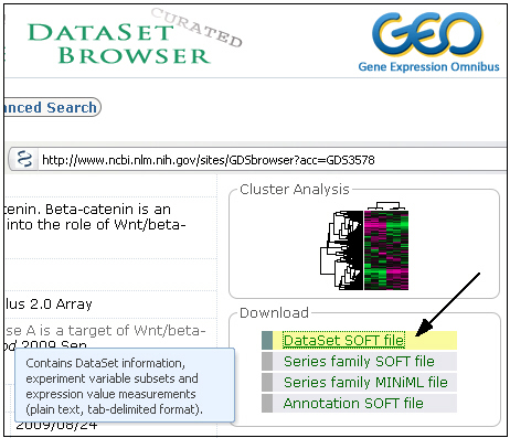
| step 12.1 | Download the GDS472.his file. It contains a heatmap concerning Gene expression in skeletal muscle biopsies. |
| step 12.2 | Click on the heatmap to select it and then choose the pipette-tool 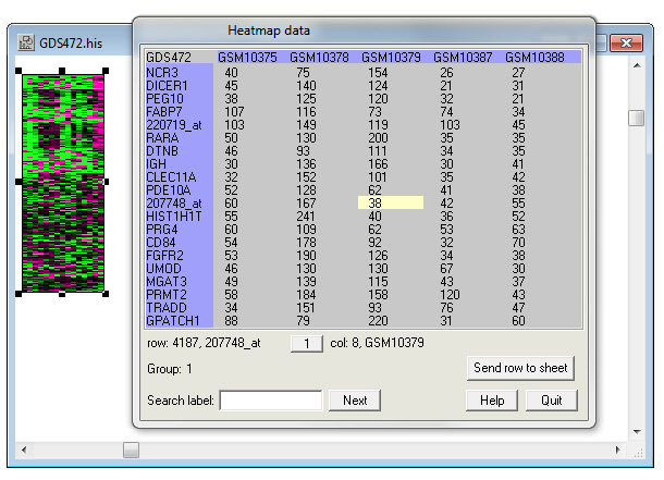 When you move over the heatmap (and NOT the new window) the columns and rows change position to show the expression of the gene pointed to by the pipette. Now move the pipette over the new window and double-click on the top-left corner in the box displaying 'GDS472'. A texteditor shows the header data of the original GDS472.soft file downloaded from NCBI. 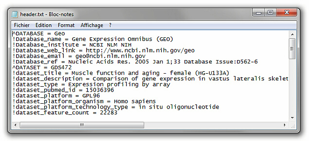 Push the 'Quit' button to end this exercise. |
step 12.2 |
|
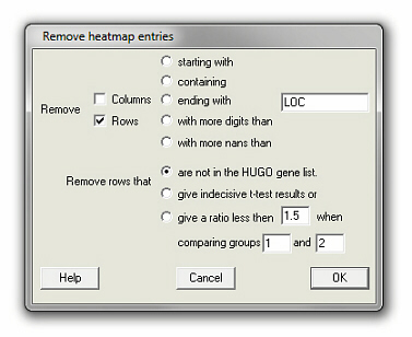
| Now the heatmap only contains genes that are in the HUGO list of genes. The entries that were removed are shown again in a text editor. | |
| step 12.3 | Now, select Make cluster (tree) from the Heatmap menu and push the OK button in the dialogue box that comes up. . 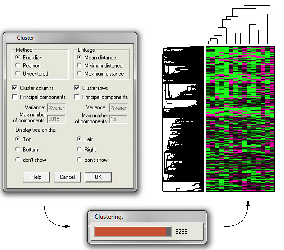 |
Thanks are due to those who have stimulated the development of this program with their useful comments.
I'd like to thank in particular Joseph Skopp at the University of Nebraska who sent me his error function routine.
This program contains the sixth public release of the Independent JPEG Group's free JPEG software. This software is the work of Tom Lane, Philip Gladstone, Luis Ortiz, Jim Boucher, Lee Crocker, Julian Minguillon, George Phillips, Davide Rossi, Ge' Weijers, and other members of the Independent JPEG Group.IJG is not affiliated with the official ISO JPEG standards committee.